Packaging &
Display
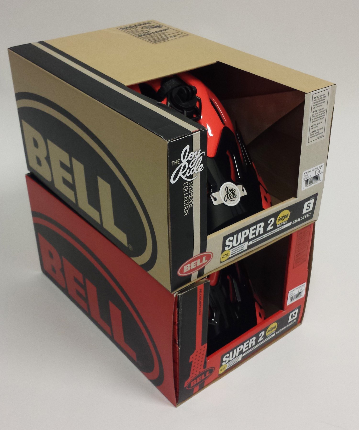
Launched in 2020, this packaging refresh featured two variations — a premium black version for only our top-tier helmets and a kraft version for the majority of the line. I worked closely with the Global Brand Director and Creative Director, as well as our Far East team to develop the new kraft material design using flexo inks. This resulted in lower packaging costs for hundreds of SKUs along with a more modern, cohesive, and sustainable design.
Bell Bike & Powersports Global Packaging Redesign
Prior to the packaging redesign, I had designed a universal hangtag system to highlight our helmet’s key technologies and features. Since each helmet model received a different set of hangtags and I had to ensure that each of them visually cascaded gracefully, I came up with a hangtag matrix to manage each of the Bills of Materials (BOMs). I also managed the initial costing evaluation in order to get it approved.
Bell Hangtag System
Falconboard In-Store Bell Helmet Displays
These displays were designed and prototyped, but never went into production due to budget constraints. The idea was that new graphic panels could be printed and swapped out for different helmets or campaigns for both Bike and Motorcycle. The base displays had evergreen Bell branding. The counter display was engineered so that it could be hung on slatwall as well.
Bell Joy Ride
Women’s Collection
In 2015, we launched a women’s collection of helmets. We wanted to create unique packaging that stood apart from the rest of the line. The goal was to avoid a “shrink it and pink it” approach and design for the vast demographic of female riders. This neutral solution elevated the product and stood out from the rest of the red-and-black Bell boxes.
Bell USA
Helmet Packaging
This project was written up in the Wall Street Journal because both the helmet and packaging were 100% made in the USA — something unique at the time in the mass helmet industry. I designed the packaging to stand apart from our standard packaging, calling attention to the main selling feature — Made in the USA. This was part of a greater Walmart initiative to promote domestic manufacturing.
Nordic Naturals Product
& Promotional Displays
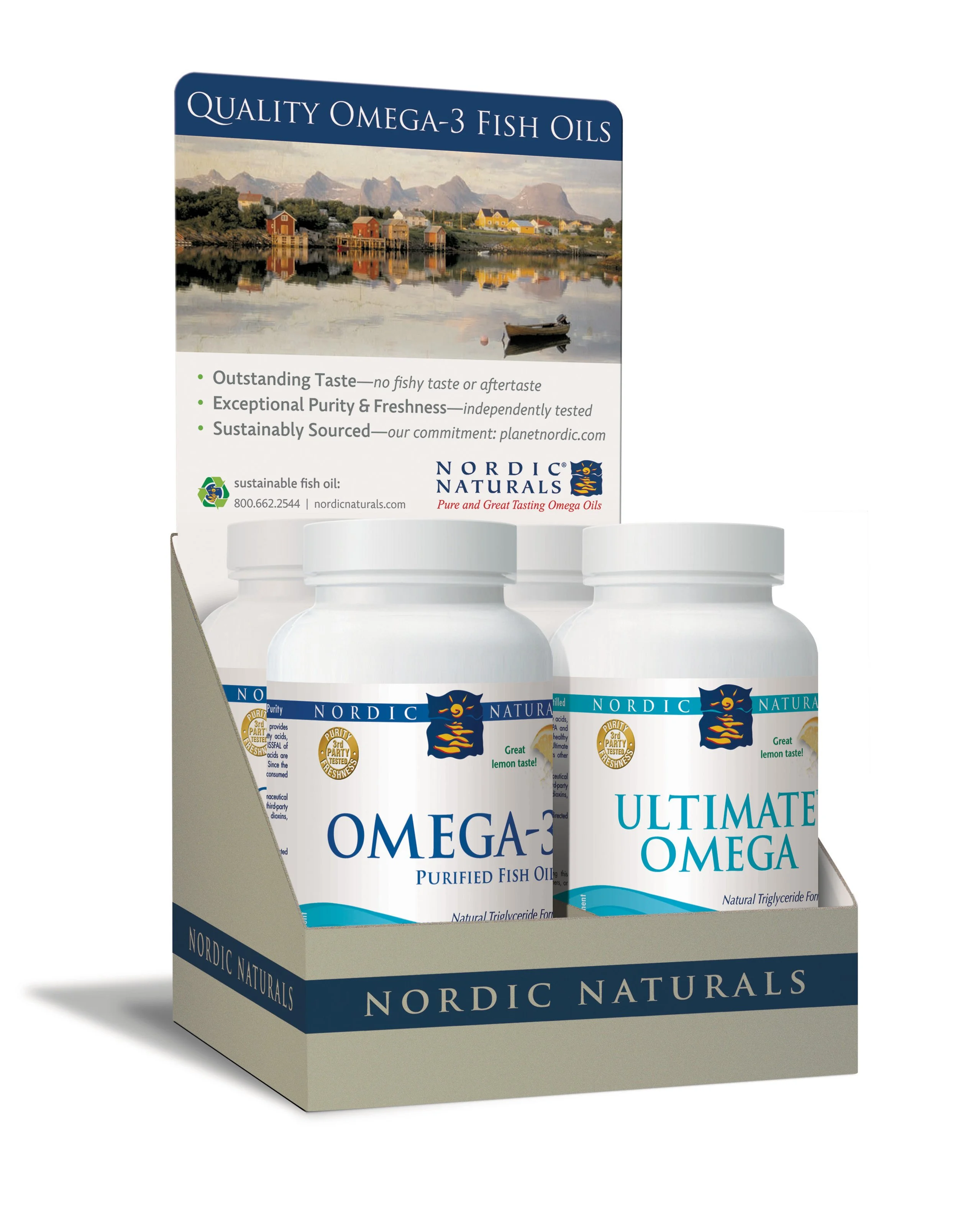
Nordic Naturals has always been intensely focused on quality and sustainability. So plastic was never an option for POP displays. Because wood displays are so expensive to produce and ship, I designed a cardboard version that held was flexo-printed with a one-color wood-grain texture. Other product and promotional displays were designed using natural kraft material.
Isblå Bottle Labels
Isblå sells fish oil and other dietary supplements to the Scandinavian region and the UK. They wanted to redesign their labels with something unique to the market. This rich design has a color system based on the flavor.


